
Almost daily our firm is reviewing at least one of our clients’ web analytics. Over the past year or so, we have seen the number of mobile devices (tablets and phones) used to access our clients’ web site surpassing 20%. Many predict that this number will exceed 50% within the next three (3) years. It is incumbent of us, and any legitimate web firm, to figure out how to best manage the users experience.
The newest and perhaps most significant trend in website design over the last few years is Responsive Design. The formal definition of Responsive Design is a web design approach centered on creating web sites that provide an optimal viewing experience at a variety of screen resolutions and formats. This includes easy reading and navigation with a minimum of resizing, panning, and scrolling. These websites work well across a wide range of devices including traditional computers, tablets and smartphones.
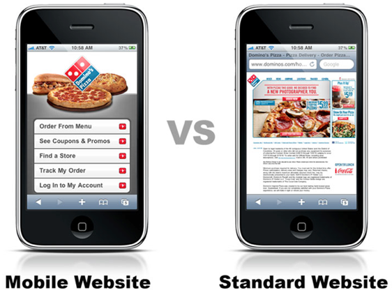
We all likely recall loading web sites using our smart phones or tablets only to be defaulted to a mobile optimized version. See the Dominos Pizza example below. Typically, at the bottom of the bottom of the mobile version is a text link to view full site.
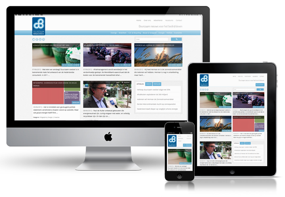
Responsive Design is an alternative approach to creating a unique, separate mobile version. Responsive Designs are ones that anticipate then respond to your users’ needs. It anticipates how to best render the site on the various devices available. This article is not about the mechanics of how, but the fact that this technique is being employed and if you are developing a new site now, you may very well want to consider this technique or risk having an outdated site the day you launch it. See the image below for an example of Responsive Design.
WebConnection remains committed in providing the most current techniques to our clients and partners. Responsive Design is just that. If you are interested in learning more, contact us at 410-656-3006 or fill out our online contact form.